LogoLogo
  • A better way to do...stuff!
  • How we build the app
    • Overview
  • Documentation
    • Draftbit
      • Using Live Preview
      • Workspaces and Billing
      • Introduction to the Builder
      • Layout
      • Intro to Navigation
      • Fetching Data
      • Direct Integrations
      • FAQs
      • Draftbit
      • Draftbit
      • Custom Blocks
      • Borders, Background, and Elevation
      • Actions
      • Custom Screen Code
      • Exporting and Publishing Your Project
      • Sharing Your Project Online
      • Publishing Your App as a PWA
      • Stack Navigator
      • Tab Navigator
      • Draftbit
      • Draftbit
      • Basic
      • Media
      • REST Services & Endpoints
      • REST API Integrations
      • Themes & Styling
      • Submitting Data
      • Draftbit
      • Draftbit
    • Xano
      • resources-and-tips-1
        • 🎞️ Xano Video Tutorials
        • 🤝Community Corner
        • 💰Share Xano. Make money
      • FAQ
      • getting-started
        • ⚡ Jumpstart
        • 🎞️ The Xano Interface
      • instances
        • What is an Instance?
        • Early Access Instance
        • Upgrading an Instance
        • Sharing
        • Bandwidth Usage
        • API Rate Limit
      • What is a Workspace?
      • Dashboard
      • Database
      • Airtable Import
      • API
      • Library
      • Marketplace
      • Settings
      • authentication
        • Authentication
        • Sign-up & Log in
      • data-manipulation
        • The Function Stack
        • Addons (GraphQL-Like)
        • The Expression Builder
        • External Query Manipulation
        • Timestamp
        • Filters
        • Images
    • Expo
      • Creating your first build - Expo Documentation
    • Kommunicate
      • Installation
      • Installation
      • Installation
      • Installation
      • Installation
      • Flutter Installation
      • Installation
      • Zapier Integration
      • Authentication
      • CMS Installation
      • Authentication
      • Conversation
      • Conversation Assignment
      • Customization
      • Localization
      • Logout
      • Web Troubleshooting
      • Installation
      • Authentication
      • Push Notification
      • Conversation
      • Customization
      • Localization
      • Logout
      • Installation
      • Authentication
      • Push Notification
      • Conversation
      • Customization
    • Formito
      • basics
        • Getting Started
        • Variables
        • Are you GDPR ready?
        • How to prefill the values of my chatbot?
      • connect
        • How to connect Formito to Zapier?
      • convert
        • How to convert old formito chatbots to the new version?
        • How to convert Google Forms into a chatbot?
        • How to convert a Monday.com board to a chatbot?
        • How to create chatbot from QuickBase table?
      • guide
        • How to add my chatbot to WordPress?
        • How to create a chatbot for Zendesk?
      • shopify
        • How to embed my chatbot into a Shopify page?
        • How to display Formito chatbot on bottom corner of my Shopify store?
        • How to open my chatbot after clicking on links or buttons?
    • Stonly
  • Flex Stuff
    • App
    • APIs
    • Database
    • Website
    • Design
    • Style Guide
  • Content
    • Guides
    • ChatBots
    • Blogs
    • Whitepapers
  • Company
    • About us
    • Brand
    • Roadmap
    • Policies
  • Flex Together
    • Overview
    • Fair Finance
Powered by GitBook
On this page

Was this helpful?

  1. Documentation
  2. Draftbit

Introduction to the Builder

PreviousWorkspaces and BillingNextLayout

Last updated 4 years ago

Was this helpful?

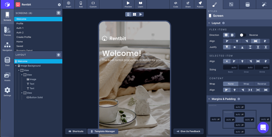
The Layer Tree (the left-hand side of the Builder) is where you are able to view all the components you've placed on a screen, rearrange them, and see their relationship with other elements.

To add components to the Layer Tree, click the '+' next to Layout to launch the component picker. In this menu you can click to add components to the Layer Tree.

Bits are what we consider to be primitives that include real React Native components and Draftbit components. These are essentially base-level components in our system that cannot be edited or changed.

Blocks are what we consider complex components or a collection of Bits that are capable of being updated or further customized. In the Blocks section you'll find we've provided a range of built-out components that require minimal configuration so you can get back to building.

To rearrange components, simply click the component in the Layer Tree, drag it and drop it where you would like it to go instead.

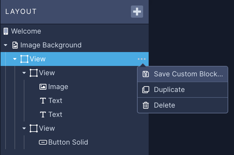
To delete a component, duplicate a component or create a , click the '...' next to the component name to launch a context menu.

Click the '+' next to Screens to open the menu that will allow you to add a blank screen or a screen from our Example Gallery to your app.

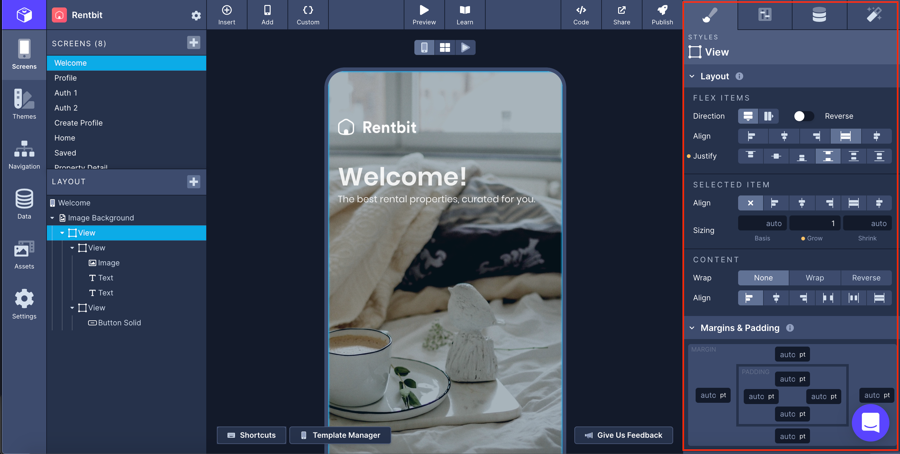
The Properties Panel (the right-hand side of the Builder, boxed in red) is composed of 4 different tabs. From left-to-right, these tabs are:

1. Styles Tab Where you'll configure and .

2. Properties Tab Where you'll configure the properties specific to each component. You can reference the component's documentation for specifics on configurable properties of each component.

3. Data Tab Where you'll configure components to in your app.

4. Interactions Tab Where you'll configure and

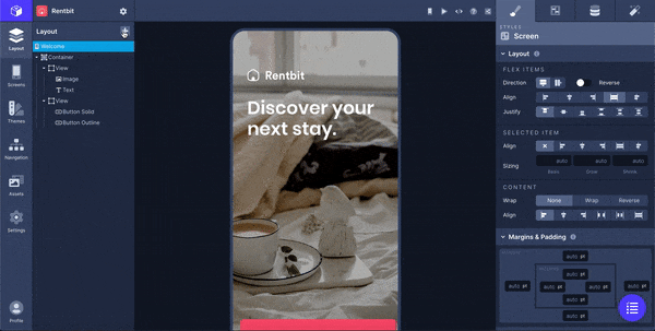
The Builder defaults to the Single Screen View which will display the Screen you have selected in the Screens list on the left-hand side.

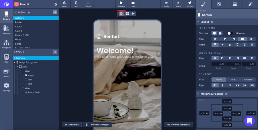
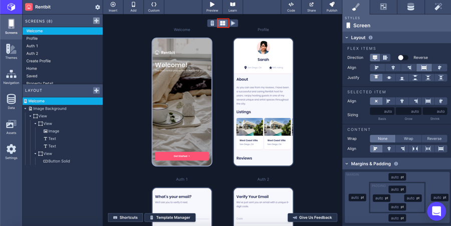
To switch to the Multiple Screen View and see all of the screens in your project, click the 4-panel square button above the Web Preview screen.

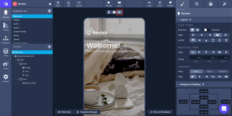
To switch to the Preview mode which loads the full Live Preview directly in the browser, click the ▶️button

You can open a variety of different menus and share your app with multiple publishing options from the top bar of the Builder.
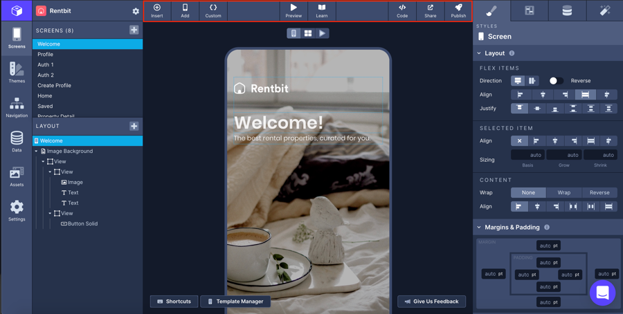
From left to right:

  • Insert: Opens the component drawer.

  • Add: Opens the modal to add a new screen.

Custom: Opens the menu.

Preview: Generates a QR code to be scanned to launch .

Learn: Opens a modal with links to Documentation and .

Code: Opens the View Code modal where you can also your project.

Share: Opens a prompt to generate a for your project.

Publish: Opens a prompt to publish your app as a .

Updated about a month ago

Custom Screen Code
Live Preview
Community
export
shared link
PWA
Table of Contents
Layer Tree
Adding and Rearranging Components
Adding a Screen
Properties Panel
Builder Views
Top Bar
Custom Block
Layout
Additional Layout and Style Options
Fetch & List
Fetch Data
Navigation
Actions