
Basic
The most simple & essential components to build a screen
The most fundamental component for building a UI, View is a container that supports layout with flexbox, style, some touch handling, and accessibility controls. View maps directly to the native view equivalent on whatever platform React Native is running on, whether that is a UIView,
, android.view, etc.
A view is designed to be nested inside other views and can have 0 to many children of any type.
Parameter
Description
accessible
When enabled, the element will be defined as accessible (defaults to true)
accessibilityLabel
Text in this input will override what the user's screen reader would read by default
accessibilityHint
Additional explanation of what happens when a user interactions with an accessibility element
accessibilityRole
Defines the role of the element for the user's screen reader
accessibilityElementsHidden
Enable to hide accessibility elements within the View (defaults to false)
accessibilityIgnoresInvertColors
Enable to prevent the color of the View from being inverted if color inversion is turned on
accessibilityLiveRegion
Determine how accessibility services should inform the user of any changes made to the View
importantForAccessibility
Determines the View's importance for accessibility and also how accessibility events work
hitSlop
Defines how far away a touch event will be registered from the View
pointerEvents
Determines if a View can handle touch events
removeClippedSubviews
Used for scrolling content that contains offscreen subviews (subviews must have overflow: hidden)
collapsable
Enable to automatically remove the View from the native hierarchy if it's unneeded in order to optimize performance
needsOffscreenAlphaCompositing
Determine if the View should be rendered offscreen and composited with an alpha in order to preserve original colors and blending behavior.
renderToHardwareTextureAndroid
Determine if the View and its children should be rendered into one hardware texture on the GPU.
shouldRasterizeIOS
Enable to render the View as a bitmap before compositing
clickable
If true, the View will be clickable for accessibility hints.
FlatList Render Item
Item: returns renderItem (default)
Header: returns a ListHeaderComponent
Footer: returns a ListFooterComponent
Separator: returns a ItemSeparatorComponent
Empty: returns a ListEmptyComponent
A symbol representing a object or an item.
Parameter
Description
Name
The icon selected from the icon picker.
Size
The width and height of the icon.
Color
The color of the icon.
A basic component to display text.
Parameter
Description
Text
The text that will be displayed in the component.
accessibilityLabel
Text in this input will override what the user's screen reader would read by default
accessibilityRole
Defines the role of the element for the user's screen reader
accessible
When enabled, the element will be defined as accessible (defaults to true)
adjustsFontSizeToFit
Enable to automatically scale fonts to fit certain constraints
allowFontScaling
When enabled, fonts will scale for accessibility (defaults to true)
dataDetectorType
Defines the type of data
disabled
Creates a disabled view of the text for testing purposes
ellipsizeMode
Determine how text will be truncated, only if numbersOfLines prop is set
maxFontSizeMultiplier
Define the font's maximum scale only if allowFontScaling is enabled
minimumFontScale
Define the font's maximum scale only if adjustsFontSizeToFit is enabled
numberOfLines
Set the maximum number of lines to be displayed when ellipsizeMode is set
selectable
When enabled, the user can select text for copying and pasting
selectionColor
Set the highlight color of the text
suppressHighlighting
When enabled, there will be no visual indication when the user presses down on text
textBreakStrategy
Set the text break stategy
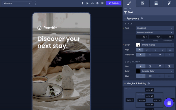
In addition to directly selecting the Typography set in the Theme you're currently using, you have the option to select a custom font directly from the Builder in the Styles tab.
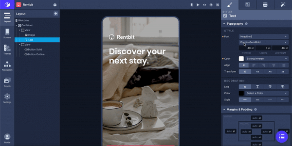
You can add custom Text/Text Decoration and Border Decoration colors by clicking the color panel next to the color dropdown in the Properties Panel. In this window, you can use the color picker, enter a HEX value, or an RGBA value to select a custom color for the property you've selected.
 Updated 7 months ago
Last updated
Was this helpful?