LogoLogo
  • A better way to do...stuff!
  • How we build the app
    • Overview
  • Documentation
    • Draftbit
      • Using Live Preview
      • Workspaces and Billing
      • Introduction to the Builder
      • Layout
      • Intro to Navigation
      • Fetching Data
      • Direct Integrations
      • FAQs
      • Draftbit
      • Draftbit
      • Custom Blocks
      • Borders, Background, and Elevation
      • Actions
      • Custom Screen Code
      • Exporting and Publishing Your Project
      • Sharing Your Project Online
      • Publishing Your App as a PWA
      • Stack Navigator
      • Tab Navigator
      • Draftbit
      • Draftbit
      • Basic
      • Media
      • REST Services & Endpoints
      • REST API Integrations
      • Themes & Styling
      • Submitting Data
      • Draftbit
      • Draftbit
    • Xano
      • resources-and-tips-1
        • 🎞️ Xano Video Tutorials
        • 🤝Community Corner
        • 💰Share Xano. Make money
      • FAQ
      • getting-started
        • ⚡ Jumpstart
        • 🎞️ The Xano Interface
      • instances
        • What is an Instance?
        • Early Access Instance
        • Upgrading an Instance
        • Sharing
        • Bandwidth Usage
        • API Rate Limit
      • What is a Workspace?
      • Dashboard
      • Database
      • Airtable Import
      • API
      • Library
      • Marketplace
      • Settings
      • authentication
        • Authentication
        • Sign-up & Log in
      • data-manipulation
        • The Function Stack
        • Addons (GraphQL-Like)
        • The Expression Builder
        • External Query Manipulation
        • Timestamp
        • Filters
        • Images
    • Expo
      • Creating your first build - Expo Documentation
    • Kommunicate
      • Installation
      • Installation
      • Installation
      • Installation
      • Installation
      • Flutter Installation
      • Installation
      • Zapier Integration
      • Authentication
      • CMS Installation
      • Authentication
      • Conversation
      • Conversation Assignment
      • Customization
      • Localization
      • Logout
      • Web Troubleshooting
      • Installation
      • Authentication
      • Push Notification
      • Conversation
      • Customization
      • Localization
      • Logout
      • Installation
      • Authentication
      • Push Notification
      • Conversation
      • Customization
    • Formito
      • basics
        • Getting Started
        • Variables
        • Are you GDPR ready?
        • How to prefill the values of my chatbot?
      • connect
        • How to connect Formito to Zapier?
      • convert
        • How to convert old formito chatbots to the new version?
        • How to convert Google Forms into a chatbot?
        • How to convert a Monday.com board to a chatbot?
        • How to create chatbot from QuickBase table?
      • guide
        • How to add my chatbot to WordPress?
        • How to create a chatbot for Zendesk?
      • shopify
        • How to embed my chatbot into a Shopify page?
        • How to display Formito chatbot on bottom corner of my Shopify store?
        • How to open my chatbot after clicking on links or buttons?
    • Stonly
  • Flex Stuff
    • App
    • APIs
    • Database
    • Website
    • Design
    • Style Guide
  • Content
    • Guides
    • ChatBots
    • Blogs
    • Whitepapers
  • Company
    • About us
    • Brand
    • Roadmap
    • Policies
  • Flex Together
    • Overview
    • Fair Finance
Powered by GitBook
On this page

Was this helpful?

  1. Documentation
  2. Draftbit

Themes & Styling

PreviousREST API IntegrationsNextSubmitting Data

Last updated 4 years ago

Was this helpful?

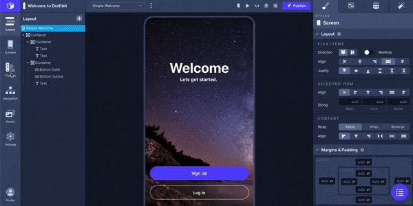
A variety of pre-built themes are ready for use under the Themes tab. Simply click the theme you'd like to use from this menu to apply the Theme to your screen.

If you have a specific theme in mind, you're able to create your own theme by clicking the '+' in the top-right corner of the menu that will launch a modal where you can create and customize your own theme. Read more about the configuration options available under each section.

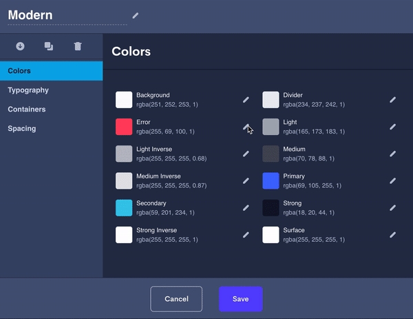
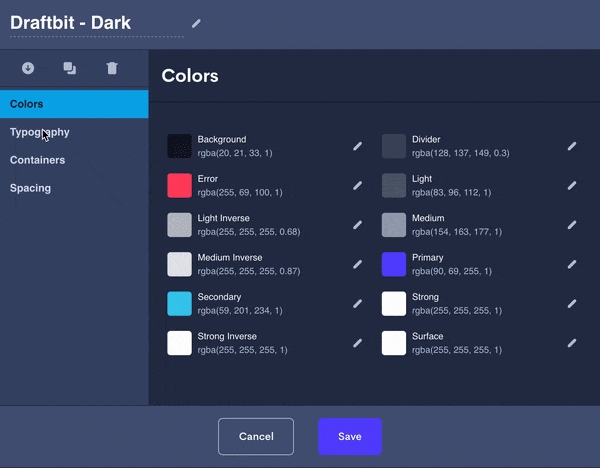
In this tab, you are able to configure the color palette to be used throughout your project. Please note: Certain settings are automatically applied to certain components that are described in the table below.

📘You can override these colors choices in the Properties Panel

For the Background: Select the Screen in the Layer Tree and select a new color in the 'Styles' tab.

For Components: You can do this by going to the 'Configs' tab and selecting a new color under the Color Override property.

When you click the eyedropper, a color picker will appear where you are able to use the color picker to select a color or cycle between the options to enter a hex, RGBA, or HSLA value for your color.

You can add custom and colors by clicking the color panel next to the color dropdown in the Properties Panel. In this window, you can use the color picker, enter a HEX value, or an RGBA value to select a custom color for the property you've selected.

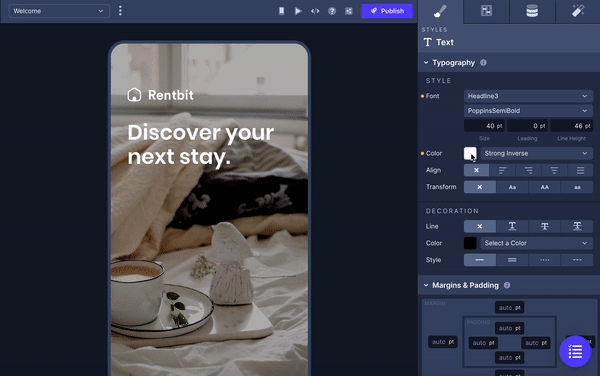
In this tab, you are able to set the typography to be used throughout your project.

Draftbit offers numerous type styles that can be set individually to your liking. In the picture below, you'll see what text looks like in each available type style in the default Draftbit theme. In addition to changing the font for each type, you are able to set the Font Size, Spacing and Line Height.

Set the default appearance of the corners of used in your project.

Set the Global Radius setting which can be applied to components under the section of the Properties Panel.

All of the options on this page are configured with the number of absolute pixels you would like to apply.

Parameter

Description

Text Spacing

Adjusts padding between headlines and body text within components.

Small Spacing

Smaller margins between related content such as cards, lists, and grids.

Medium Spacing

Medium padding between related content such as elements in cards. Buttons also inherit this padding.

Large Spacing

Larger margins between content and used inside cards as well as margins between lists of rows.

Gutters

Adjusts left/right margins of Containers.

In this tab, you are able to configure the Elevation that can be applied to or . Here you are able to customize the color, size, opacity, and position of the drop shadow across 4 different Elevation settings.

Updated 7 months ago

Cards
Containers
Table of Contents
Colors
Typography
Type Styles
Containers
Spacing
Text/Text Decoration
Border Decoration
Buttons
Borders