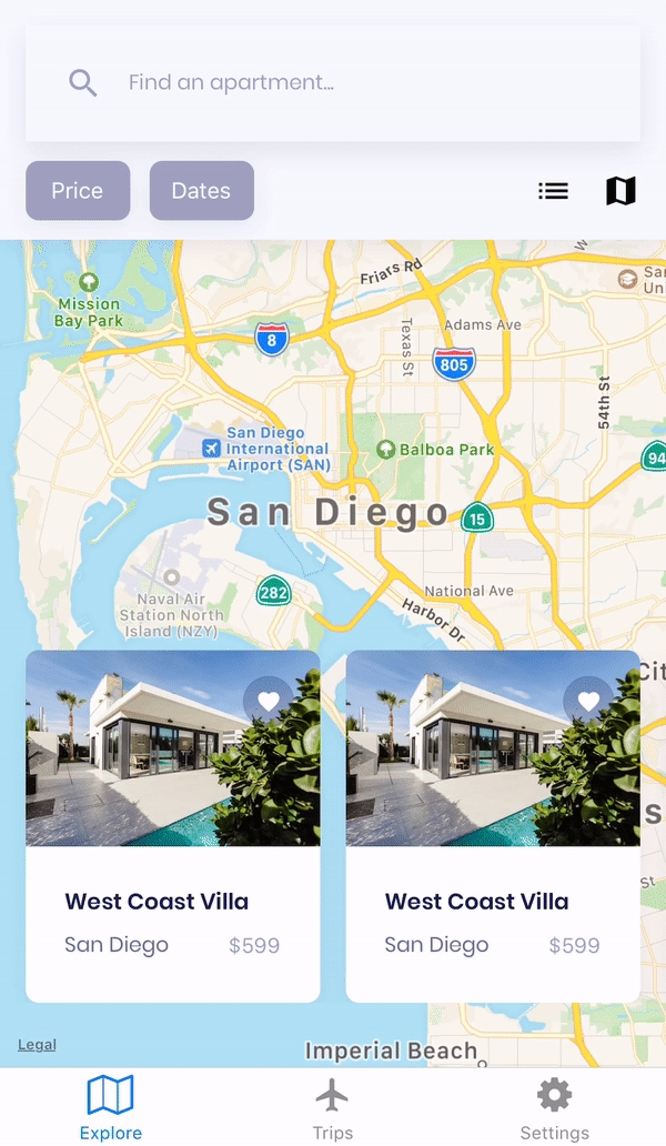
Tab Navigator
Last updated
Was this helpful?

Last updated
Was this helpful?
*Tab Navigators allow you to add tabbed navigation to the bottom of your app. The bar is fixed to the bottom of the screen. Each tab is linked to a screen (or navigator) and displays an active state when selected.
Parameter
Description
Font
Set the font, font size, and line height for the tab labels (Note: Show labels must be active in the configs tab).
In this section, you can set colors for a tab's Active state (when the screen attached to the tab is currently being viewed) and Inactive state (screens that are not being viewed).
Parameter
Description
Text
Icon
Background
Set the color of the area of the tab
Parameter
Description
Name
Set the name for the navigator to appear in the Navigation tree.
Initial Route(Make sure this is set)
Set a screen or navigator as the initial route.
Number of tabs
Set the number of tabs to appear in the navigator (max 5).
Show labels
Enable to show labels on each tab.
Show icons
Enable to show icons on each tab.
Label position
Set the position of the tab label.
Parameter
Description
Route
Assign a screen in the navigator to a tab.
Label
Set the label for the tab (If a label is not set in this section, the label name defaults to the screen name).
Icon
Set an icon for the tab.
Parameter
Description
Lazy Load
If enabled, tabs will only render in the active state.
Back Behavior
Set the back behavior for the navigator.
Allow Font Scaling
Enable so that the label font will scale to meet Text Size accessibility settings (defaults to true).
Adapt to Screen
Enable so the navigator adapts to the size of the screen.
Hide When Keyboard Shown
Enable so that the navigator is hidden when the keyboard appears on the screen.
Set the color of the tab label (Note: Show labels must be active in the tab).
Set the color of the tab icon (Note: Show icon must be active in the tab).
Updated 7 months ago