Layout
Last updated
Was this helpful?

Last updated
Was this helpful?
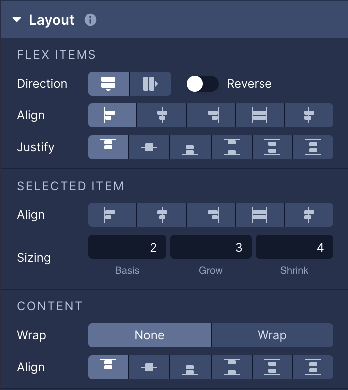
With Flexbox, you can specify the layout of an element and its children to provide a consistent layout on different screen sizes.
Setting the Flex Direction establishes the main axis and direction that child elements are placed along in the layout.
Parameter
Description
Row
Places child elements horizontally.
Column
Places child elements vertically.
Row Reverse
Places child elements horizontally and additionally reverses the order that the elements are displayed.
Column Reverse
Places child elements vertically and additionally reverses the order that elements are displayed.
Setting align items determines how child elements are spread across the remaining space of the cross axis (the opposite of the axis set in Flex Direction) they lie on.
Parameter
Description
Flex Start
Child elements are positioned at the beginning of the container.
Flex End
Child elements are positioned at the end of the container.
Center
Child elements are positioned in the center of the container.
Stretch
Child elements will stretch to fill the container.
Baseline
Child elements are positioned so that their baselines are lined up with each other.
The Justify Content property determines how children elements are spread across the remaining space of the axis they lie on.
Parameter
Description
Flex Start
Child elements are grouped together and positioned at the beginning of the line.
Flex End
Child elements are grouped together and positioned at the end of the line.
Center
Child elements are grouped together and centered in the middle of the line.
Space Between
The first child element is positioned at the beginning, the last child element is positioned at the end and all remaining child elements are spread out evenly in between.
Space Around
Child elements are spread out across the line with equal amounts of space surrounding them.
Space Evenly
Items are distributed so that the spacing between any two adjacent alignment subjects, before the first alignment subject, and after the last alignment subject is the same.
Align Self shares the same positioning behavior as align items, however, it is set on each individual child element and overrides the settings applied to the parent element in Align Items.
Parameter
Description
Flex Start
The child element will be positioned at the beginning of the container.
Flex End
The child element will be positioned at the end of the container.
Center
The child element will be positioned in the center of the container.
Baseline
The child element will stretch to fill the container.
Stretch
The child element will stretch to fill the container.
The Flex Grow property describes how a child element will automatically resize itself in relation to other child elements within a parent element.
Flex grow can be set to any number greater than 0.
Flex Shrink is generally used in tangent with Flex Grow and determines the behavior of children elements once they exceed the size of the container. Just like Flex Grow, Flex Shrink sets a relative value on the children elements. Setting an element's Flex Shrink to 0 prevents the element from shrinking at all and will retain its original size calculated from the Flex Grow setting or from the set width and height.
Flex Shrink can be set to any number greater than 0, with 1 being the default value.
Flex basis is an axis-independent way of providing the default size of an item along the main axis. Setting the flex basis of a child is similar to setting the width of that child if its parent is a container with flex direction: row or setting the height of a child if its parent is a container with flex direction: column. The flex basis of an item is the default size of that item, the size of the item before any flex grow and flex shrink calculations are performed.
Flex Shrink can be set to any number greater than 0, with 1 being the default value.
The Flex Wrap property is set on a container and determines how child elements will be laid out if they exceed the maximum dimensions of the container.
Parameter
Description
None
Forces all of the child elements onto one line and which has the potential to force shrink the elements in order to make them fit on the same line.
Wrap
The child elements will be placed along multiple lines, as needed, allowing them to retain their intended sizes.
Reverse
The same as Wrap, however the order of the child elements is reversed.
Align Content is only applicable when children elements are in a container that is set to flex wrap and there are multiple lines of children elements. Setting the Align Content property determines how the lines of elements are positioned on the cross-axis (the axis opposite of the main axis defined in Flex Direction).
Parameter
Description
Flex Start
Lines are grouped together and positioned at the beginning of the cross axis.
Flex End
Lines are grouped together and positioned at the end of the cross axis.
Stretch
Lines are stretched to the height of the container's cross axis.
Center
Lines are grouped together and positioned in the center of the container's cross axis.
Space Between
The first line is positioned at the beginning of the cross axis, the last element is positioned at the end of the cross axis, and all remaining lines are spread out evenly in between.
Space Around
All the lines are spread out across the cross axis of the container with equal amounts of space surrounding them.
Updated about a month ago